Behind the Design Midtown Modern
Oct 09, 2020 | Carpet One Floor & Home
Forget mid-century modern, this home is what I like to call “midtown modern.” Designed for an urban family, it is a combination of classic and contemporary, with an underlying elegance that echoes its owners—a vibrant, metropolitan household with a taste for high style.
Throughout the Home
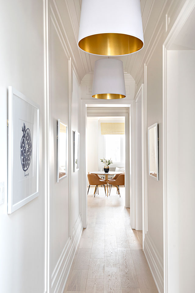
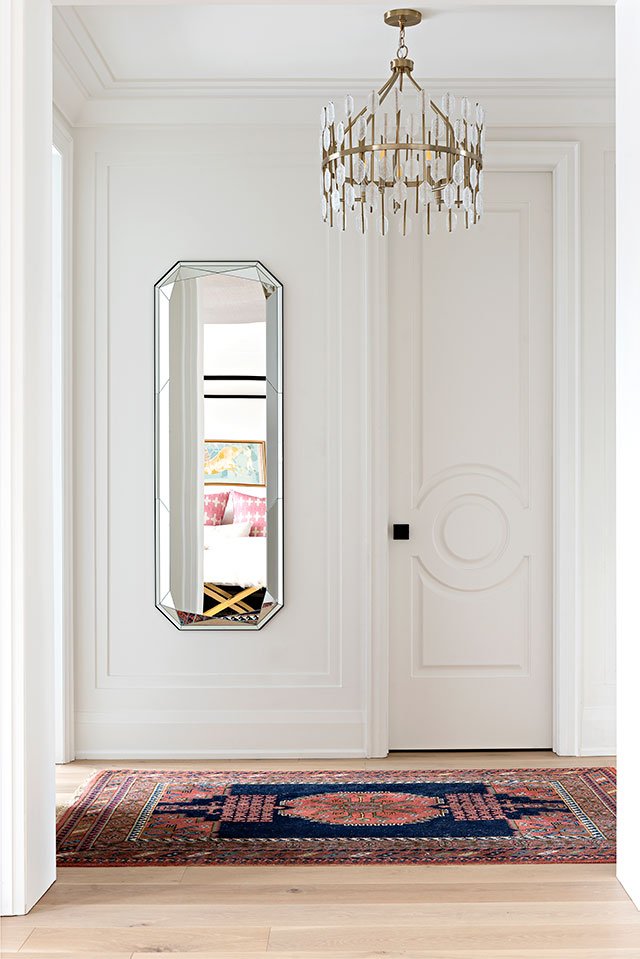
We decided to use two-step wall paneling to elevate the look and add sophistication. The high baseboards, slick door trim, and custom crown molding accentuate the home’s architectural details and high ceilings. We carried the paneling through the second floor, continuing to highlight the elegantly tall ceilings.
Throughout the home, we wanted to introduce some bold graphic patterns, which we achieved via the entry tile, wallpaper, fabrics, and cabinetry. The coral color scheme in this home is complemented by black and white, with pops of mustard yellow and navy blue. It’s modern and yet warm, elegant and inviting, “midtown modern” defined.
Our bold choice in wallpaper adds visual interest and personality. I love to use wallpaper on ceilings—a design-current, growing trend that works particularly well in this home, where the high ceilings create tons of breathing room. The wallpaper draws the eye up and shows off this stunning interior from top to bottom, without being oppressive.
The Flooring
Underfoot, we opted for white oak wide-plank floors, which are extremely forgiving. This style is very durable and can handle everyday traffic without scuffing or showing wear. The light wood also makes the space feel more expansive and wide, helping to balance out the tall ceilings. Additionally, it provides a warm, natural contrast to bold features, such as the dark kitchen cabinets and wallpaper.
By using small doses of color throughout the home, we were able to achieve an overall cohesive and impactful design.
The Kitchen
The kitchen we created certainly has a lot of personality, featuring a dark charcoal paint (Benjamin Moore’s Raccoon), which is balanced by the warm white oak of the cabinets and range hood. A black-and-white marble textural backsplash and gorgeous countertops finish this functional but beautiful prep area.
The incredible pendant lights are the showstoppers in this kitchen, adding so much visual interest with their curves in contrast to the geometric lines of the kitchen cabinets. White tableware seen behind the lightly frosted glass panes of the cabinets subtly echoes this pattern. Glass-fronted cabinets in general are an excellent way to show off stylish items and heirloom pieces that would normally be hidden.
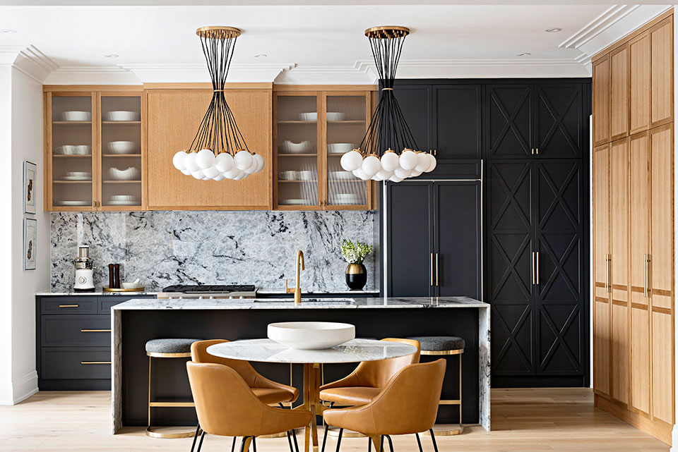
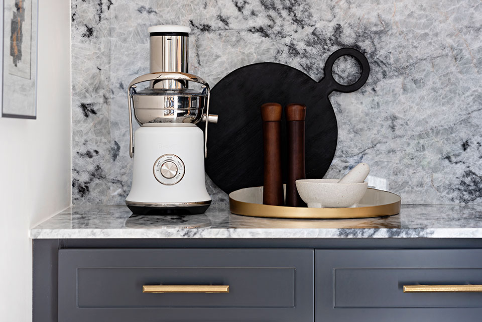
Throughout this house, we stuck with modern metal finishes of gold and matte black—a combination you can see repeated in every room. This creates a subtle continuity that doesn’t jump out at you, but strengthens an underlying aesthetic.
The Great Room
To bring style and storage space to the great room, we incorporated a custom built-in unit flanking a custom-designed Quartzsite fireplace surround and mantel. The space feels elegant and sophisticated yet still quite comfortable. The honeycomb coffee table, geometric rug, penrose-inspired painting, and other abstract trinkets give it a cerebral, engaged quality that draws out natural science-inspired themes reflected in the rest of the home. Satellite coffee tables, for placing a drink or a nibble, are easy to pull up next to the sofa.
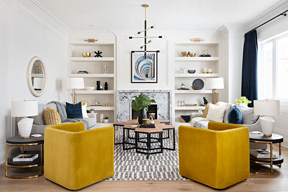
Because this is such a big, bright room with lightly colored walls, we wanted to ground the space with navy blue velvet drapery, which is elegant and beautifully textured and anchors the eye.
A Home Office
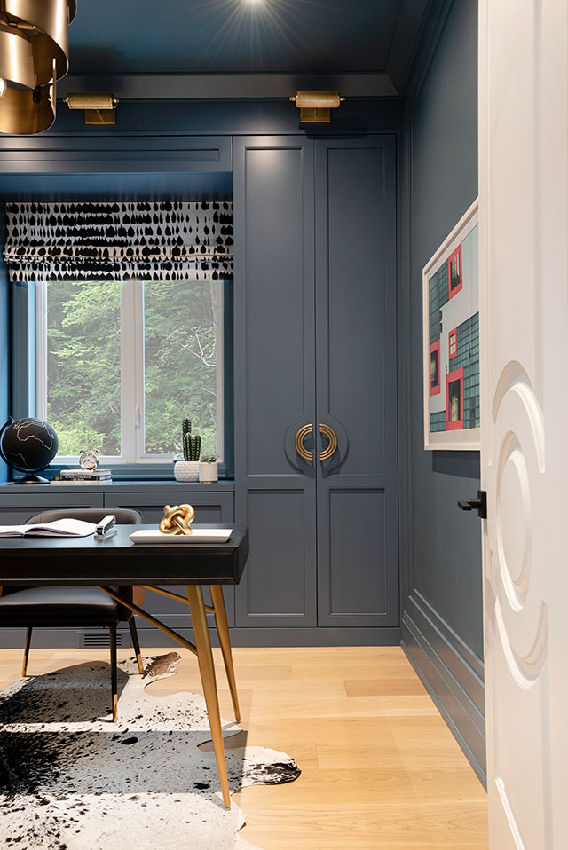
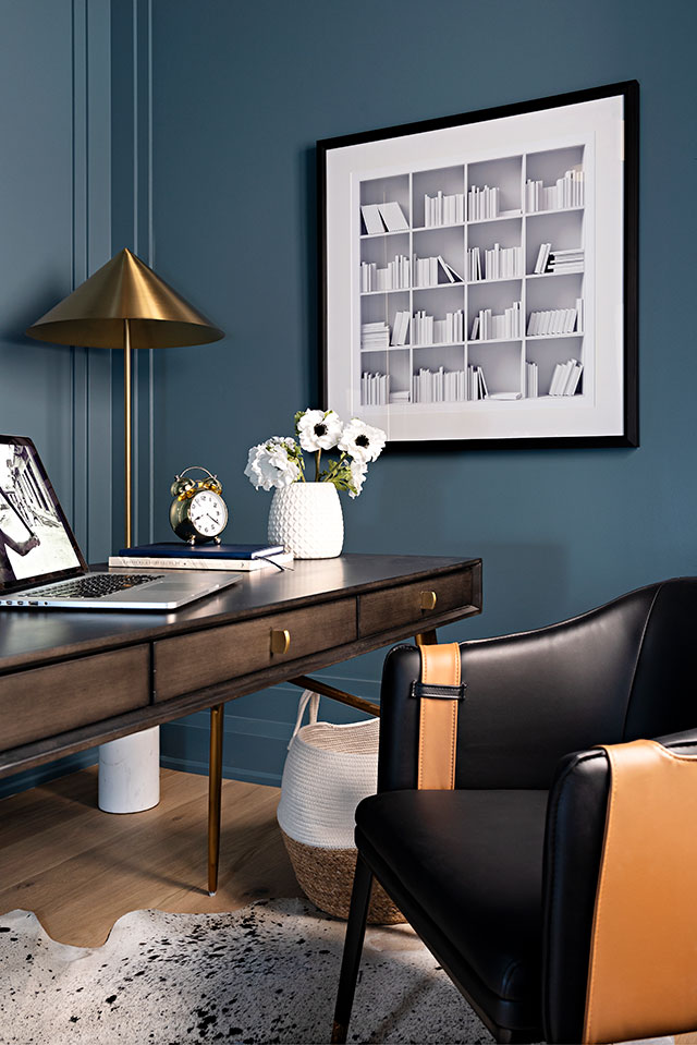
A luxury in a family home, a home office offers a rare, quiet retreat. This den is a cozy haven with mid-century modern furniture and fantastic accent lights creating an intimate atmosphere. We opted to paint the entire space with medium-toned blue lacquer. Custom millwork is made to match the hardware created for us by Shayne Fox Hardware—half-moon curves designed specifically for us. We really wanted this look, but the style wasn’t offered by suppliers, so custom was the way to go. The cabinet doors mimic the exact curve of the hardware.
The Master Bedroom
The master bedroom is a haven, featuring a backlit onyx fireplace and a grass-cloth wallpapered ceiling and a four-poster bed. A soft black-and-white pallet is a great backdrop for pops of light pink and fuchsia. The carpet is a beautiful wool Berber, and is unbelievably comfortable and plush underfoot. The vintage art above the bed ties the entire scheme together.
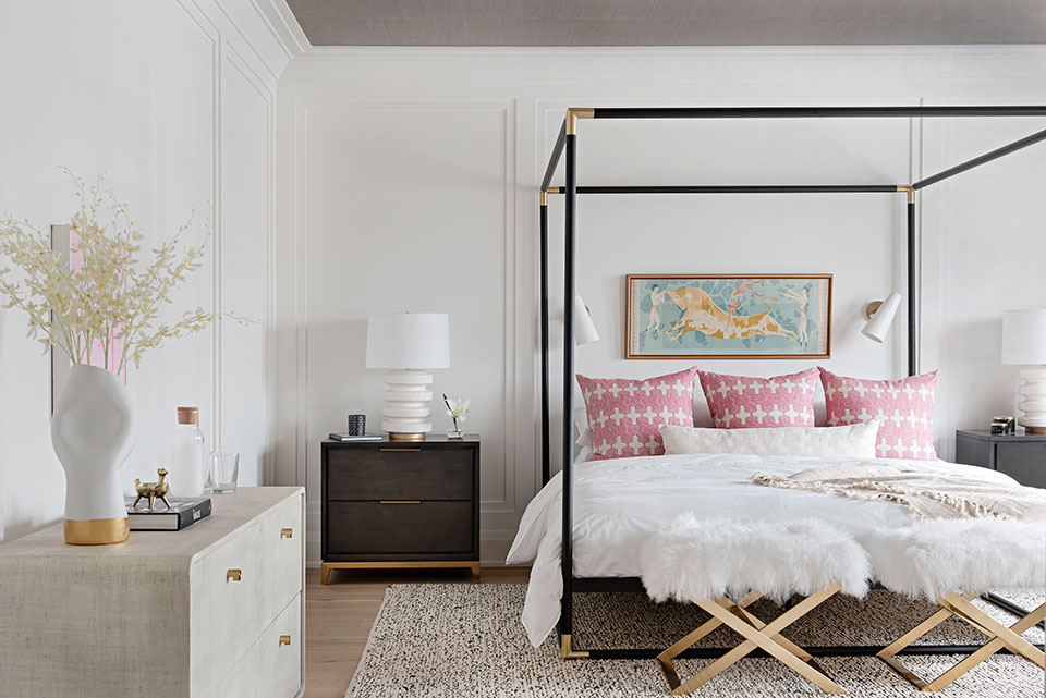
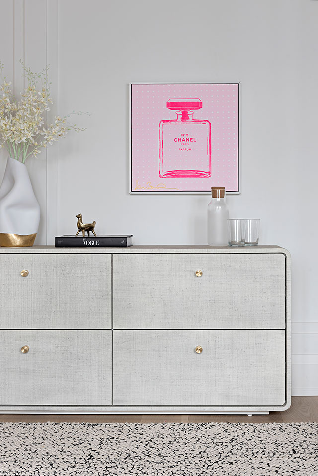
Meanwhile, the formal geometric lines formed by the bed frame, end stools, and lamps create a clean, dimensional look. They also work in combination with the Scandinavian side tables to playfully reimagine mid-century modern.
The Bathroom
The bathroom presents a fresh perspective on glam, echoing vintage powder rooms of the past with a contemporary twist. The intricate wallpaper adds striking detail that contrasts the scaled-back, sleek appearance of other areas in the home. The mustard yellow painted ceiling further draws out the room’s color, while black penny tile flooring grounds the whole look. A contemporary vanity topped with a creamy marble countertop adds a luxurious finishing touch.
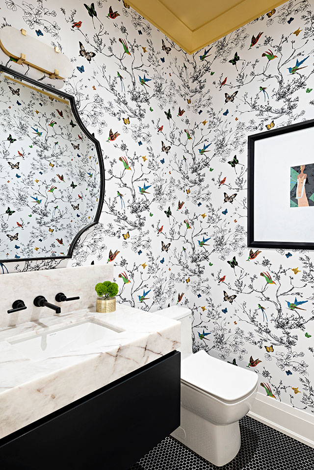
This project showcases beautiful design and a cohesive repetition of finishes and materials. The result is sophisticated, vibrant, and fun. When it comes to bold interiors, the style has to match its owner. Be inspired by travel, nature, culture, and art. Have fun creating it, and, more importantly, enjoy living in it.
The Mudroom/Foyer
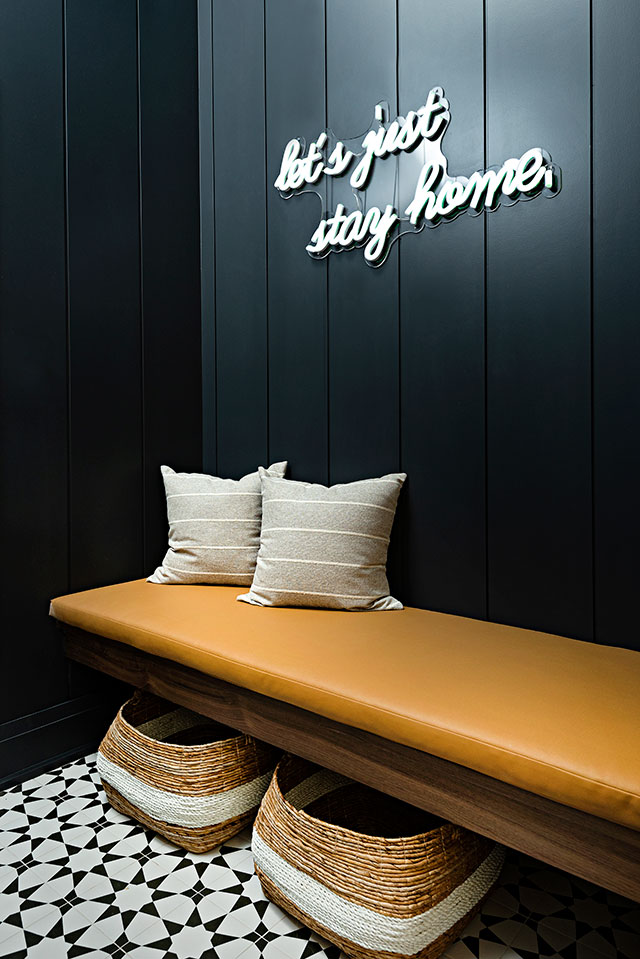
The mudroom is a sweet spot. We opted for a dramatic, dark-black painted shiplap and a built-in bench with lots of space beneath for shoes and storage items. A fun, custom neon sign that reads “Let’s just stay home.” hangs above. The homeowners love this little reminder as they come and go.
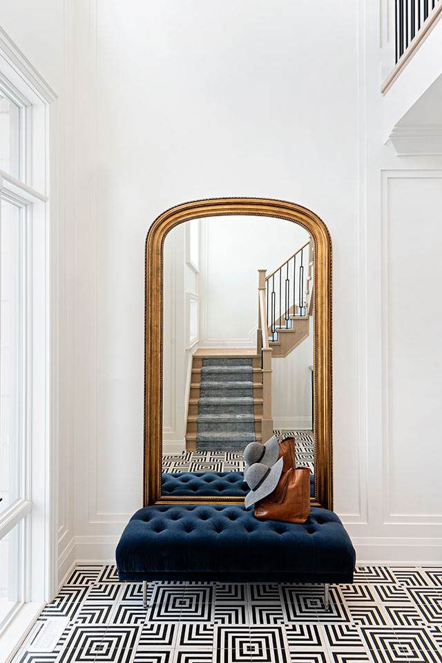
A full-length mirror framed in gold pops against a regal blue velvet bench adds as much functionality as it does style to the foyer. Greek-inspired tiles beautifully complement this piece, and create a unique, travel-inspired vibe to open up the home. The staircase and a beautiful chandelier lead you all the way up to the second floor, where we opted to wallpaper the ceiling down the hall. This gave an otherwise ordinary space interest and personality.
Interior design: REBECCA HAY DESIGNS Photography: MIKE CHAJECKI
