Designer Q and A with Louis Duncan He
Mar 15, 2021 | Carpet One Floor & Home
Louis Duncan-He takes us behind the scenes of one of his beautiful West Coast designs with a Q&A session that answers all of our questions about design, color, and intention.
What were your overall needs for this space?
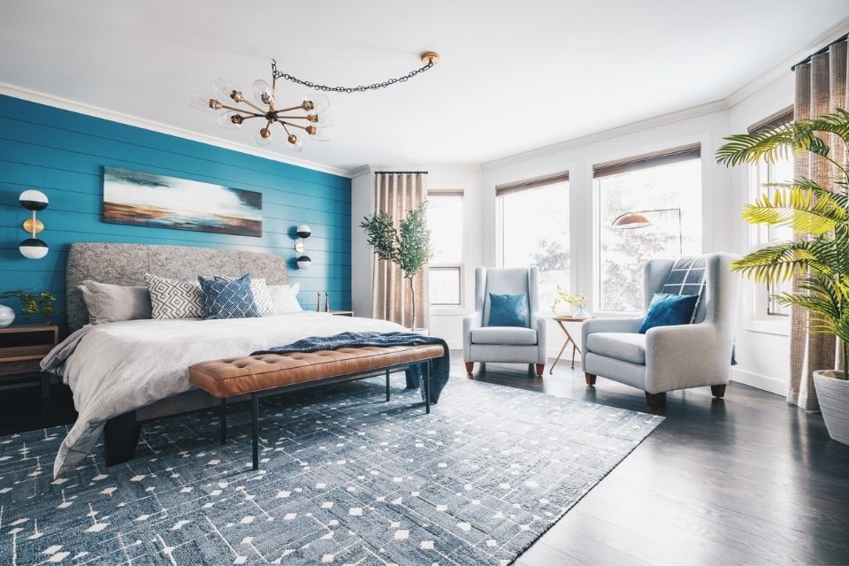
With our homeowners having both recently finishing their medical residencies, they decided to skip the transition home and go straight to their forever home. They both moved into the home with virtually no furniture as they were living with family previously. We needed to furnish most of the entire house (not the basement), and we needed drapery, styling, décor, paint selections, and light fixtures. The entire home was really gray and cold, and our homeowners wanted a much lighter, airier, and natural feeling space.
Were there any challenges designing this space?
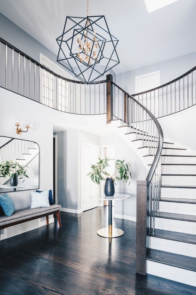
The main challenge in this space was finding the sweet spot between the two design perspectives of our homeowners. We had mid-century on one end with a desire for richer and stronger colors and light modern farmhouses with a hint of west-coast nature. We ended up using a lot of natural and organic textures as the main tones throughout the house and adding in more drama with lighting and hints of brass and wallpaper.
Did you have any special considerations or requirements when creating the room?
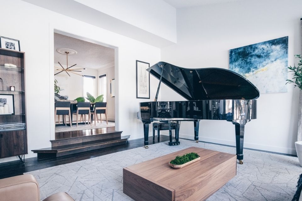
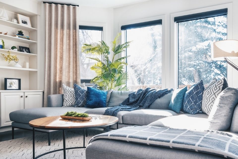
One of the only items the clients had to bring into their new home was their baby grand piano. This is a musical family, so they wanted a room that they could enjoy by themselves, but also with friends and family. We were limited in the actual layout as the room wasn’t overly sized, and was located right off the main entryway, so we needed to ensure we were featuring the piano while still maintaining functionality in the room. We also had a lot of variation in ceiling height (sloped music room and open to the entry), and a mix of dark gray tones throughout the original home. We painted most of the home white and added decorative drapery to frame the windows and create a sense of unity with the ceiling height.
Why did you choose the colors used in the space?
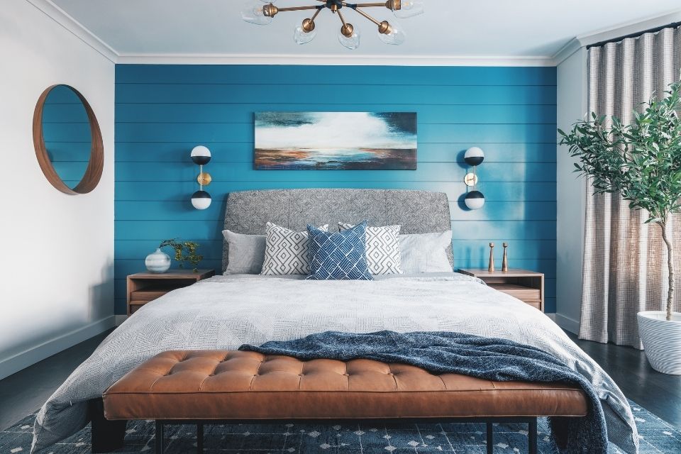
We chose colors that could be found within nature, both mountain and coast alike. We wanted to make sure that the main blue accent color they wanted to use didn’t come across as too “cookie-cutter” and literal (design by matching color numbers). We introduced brass, earthy colors, creamy taupes, and mossy greens to really add dimension and a natural sensibility. By adding a confident blue to the paneled wall detail in the master bedroom, we created a visual anchor to work the rest of the room around.
What is your favorite aspect of this project?
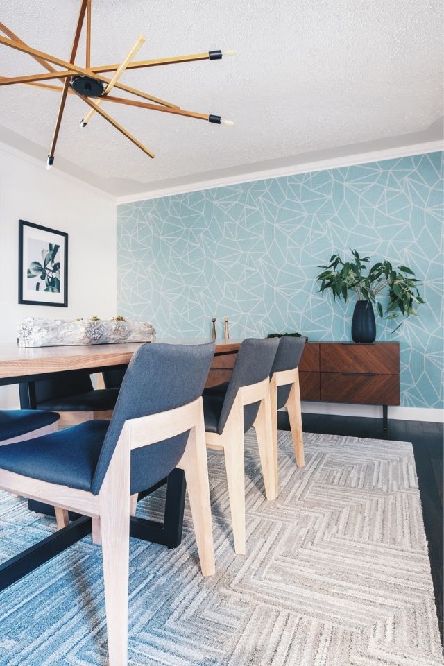
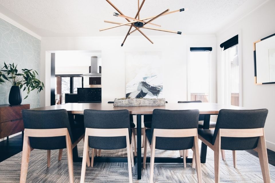
My favorite rooms are the dining room and the master bedroom. The note that we hit in these two rooms was truly a blend of both mid-century and west-coast modern. It was a lot of back and forth in balancing color, texture, and print. Metals also played a huge role in this as we chose to stay with black metal and brass to add a little luxe to the space. I love that when you enter the master bedroom, you’re transported into a very serene but also stylish getaway. I’m sure the clients will put it to great use for years to come.
What materials used echo some of the design trends for 2021?
Lots of the blue and teal tones are going to be staples of 2021 as demonstrated by Benjamin Moore's announcement of Aegean Teal. In addition, there are so many natural tones in the house that echo the trend of reconnecting with the outdoors. We have a lot of light natural wood, earthy textures in wallpaper, a lot of tone on tone, and natural materials like wicker and thicker weaves. All of these elements combined create a space that is both restorative and truly brings the outdoors in.
Design and Photography by Louis Duncan-HeDesigns