Infusing Warmth Through Trending Neutrals
Oct 07, 2021 | Carpet One Floor & Home
Featured in the 2021 Fall Issue of Beautiful Design Made Simple, Michelle Berwick shares her favorite tips on how to use trending neutrals to add warmth to your space.
We know that taking on a renovation or refresh can be a little daunting and stressful. There are so many decisions to make and directions that you can go in. We want to make this process a breeze for you. We thought, “What better way to do this than to take you for a tour through our latest interior renovation and share the evolution of this project?” It certainly is the perfect example of how to add in the warmer neutral tones flooding the design world at the moment. We are also going to let you in on some of our best-kept secrets on how to keep those neutrals interesting! Are you up for a little eye candy?
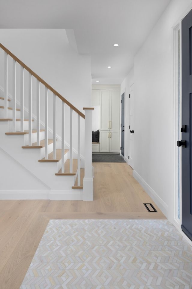
The Foyer
One of the ways we love to keep neutrals interesting is by incorporating patterns! This chevron marble hex mosaic is a prime example of how to keep a simple color palette while also kicking it up a notch with a little “somethin’ somethin’.” These inlays are the perfect mix for bringing in some eye-catching aesthetics that are still functional.
The Mudroom
Yes . . . we LOVE a good mudroom. We have been noticing more and more that the mudroom sets the rest of the home up to be more clutter-free. A “catch-all space,” yes, that’s what we’ll call it. Mudrooms should serve as a catch-all. It’s the first spot you hit when entering your home, where you leave all those things, like backpacks, shoes, coats, homework, and who knows what else, that typically overflow into your main living spaces.
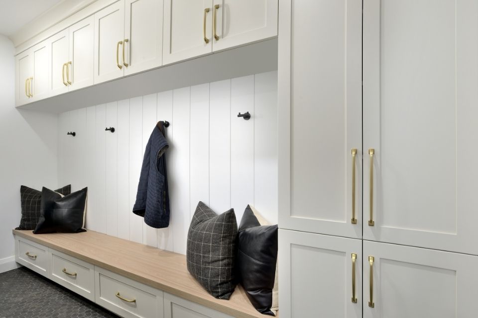
A well-thought-out mudroom can change all of that. We wanted to provide ample storage for shoes and coats that are easily accessed by the little ones and still functional for the adults. We carried through that creamy cabinetry color for a cohesive look and paired it with a faux matte marble hex floor tile to create some movement—plus, this tile hides everyday dirt!
The Powder Room
Let’s slide over to the powder room, most likely the second place you’ll hit when flying into the house. We know that feeling all too well: zipping up the driveway and PRAYING that the door is unlocked so you have no delays. (Drinking two bottles of water before your commute seemed like a good idea at the time.)
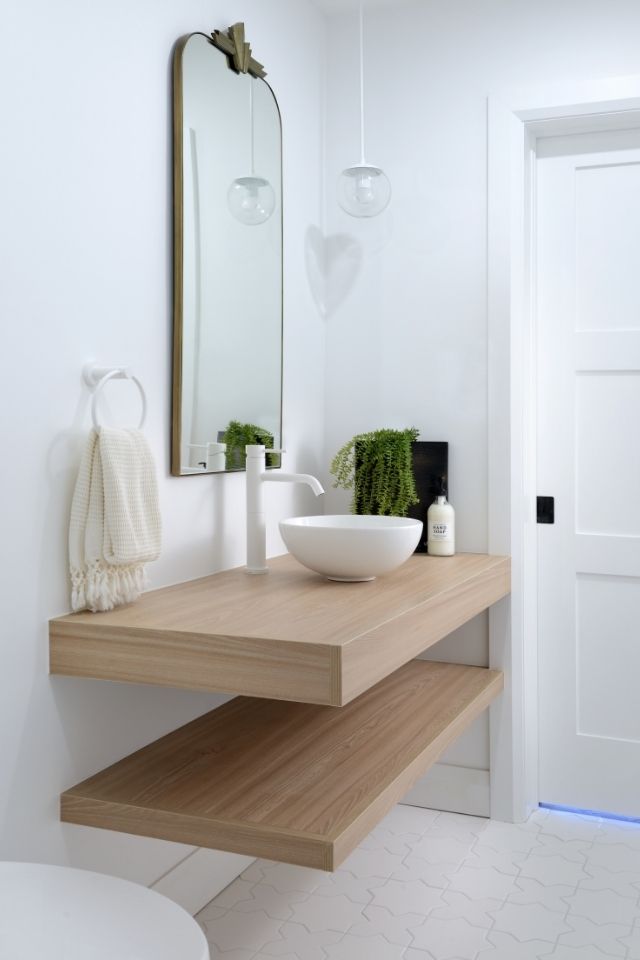
This custom vanity is the perfect piece to bring warmth to this white and bright space. To create some interest, we decided to include a mix of lights and brights, creamy and dreamy, and natural neutrals for a warm and fresh feel.
The Living Space
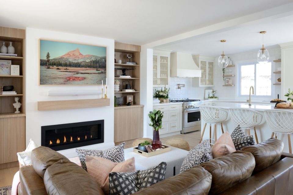
Bring it into the open-concept living space. This is the perfect spot for entertaining or keeping a watchful eye on the little ones as they play—or fight! No one wants to be shipped off to the kitchen while others are gathered in the next room. This main floor offers our clients not just one, two, or three . . . but four gathering areas. A great dynamic space for a fun, lively family.
The Kitchen
I’m sure you can guess what’s next! The kitchen. Boy, oh boy, this creamy kitchen has sprinkles of magic throughout. We packed this kitchen with tons of functional storage. Our sneaky trick is backing the island with some shallow base cabinets for those dishes, appliances, and knick-knacks that you don’t use daily.
The kitchen is one of the most important parts of the home. Most people spend a whole lot of time in this space. It also happens to lead to some of the largest costs you will endure during a renovation. We can understand the fear of not wanting to lean into the trends too hard in here. There are so many ways to incorporate special details into your kitchen renovation to create those “wow” moments everyone is looking for!
Get those creative juices flowing by thinking about bringing in some funky hardware, backsplash, overhead pendant lighting, floating shelves, mixing and matching door profiles, cabinet inlay details, interesting touches on the sides of the island, and some really wicked comfy counter stools. Check out these awesome counter stools. They hug your tush just right.
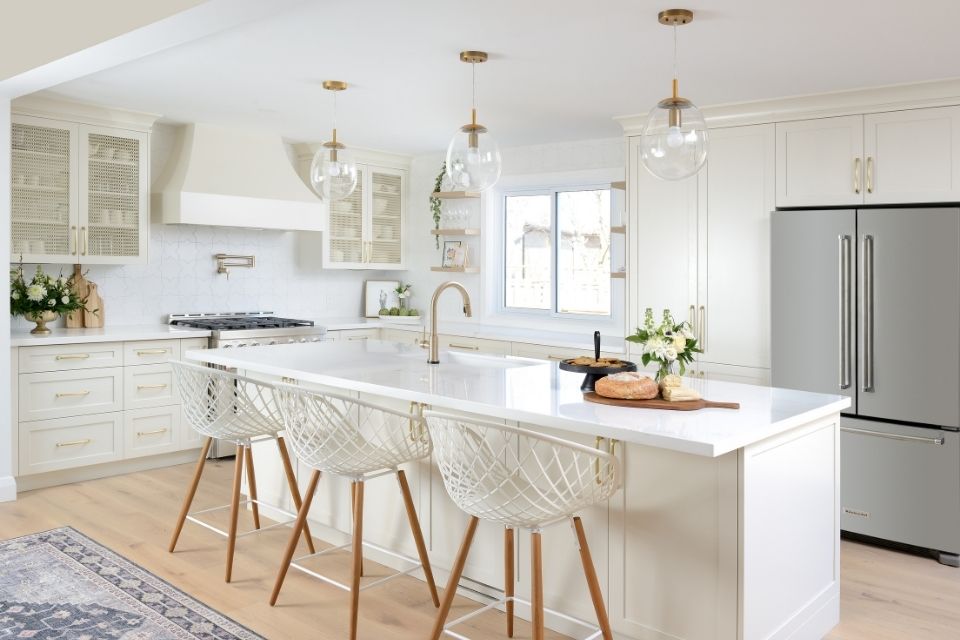
Speaking of backsplash, this white star backsplash is bringing all the pattern that we’re looking for to this kitchen. It’s neutral and timeless, but it also brings in textural interest and personality, making it the perfect complement to this kitchen.
The gold grating in those upper cabinets is a show-stopping element, adding the perfect amount of texture to the kitchen space. This is a perfect example of how to incorporate some beautiful and timeless details into the rest of your kitchen.
A great trick to giving your kitchen a functional facelift is to focus on the interior elements. Everyone lives so differently. One family may need lots of spice organization, another may have more cereal boxes than you can count, while others may have a space problem when it comes to storing cookware or Tupperware.
Find out where you need most of your kitchen storage, and start to incorporate slide-out baskets, cutting board dividers, or corner cabinet solutions to improve and maximize the overall function and usability of your available storage.
We always love to add floating shelves within the design of any kitchen. They serve as another wonderful styling opportunity for some extra personality while also providing extra everyday storage.
Hey there, curvy thang. This range hood brings a curvy organic feel to all of the sleek, straight lines, creating the perfect harmony! The range hood is one of the best ways to add some “va-va-voom!” to your kitchen. You can also use the range hood as a design opportunity to bring in some other natural materials, colors, and textures.
The “Flex” Space
Now we are touring the “flex” space. Is it a lounge? Homework area? Bar? Extra storage? It is all of these things. Each household lives very differently. Sometimes, you need one room to have multiple functions. Remember, things don’t have to be matchy-matchy to flow. Choose colors and patterns that are siblings, not twins!
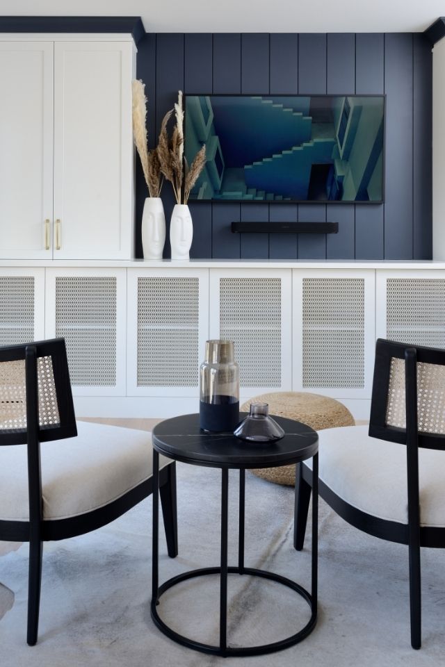
Another great way to keep neutrals interesting is by adding a few pops of color here and there! No need to seek out the brightest version of the color—something muted and soft will do the job! Think of pinks, blues, and greens . . . these are all neutrals, right? In our world, they certainly are.
The Principal Bedroom
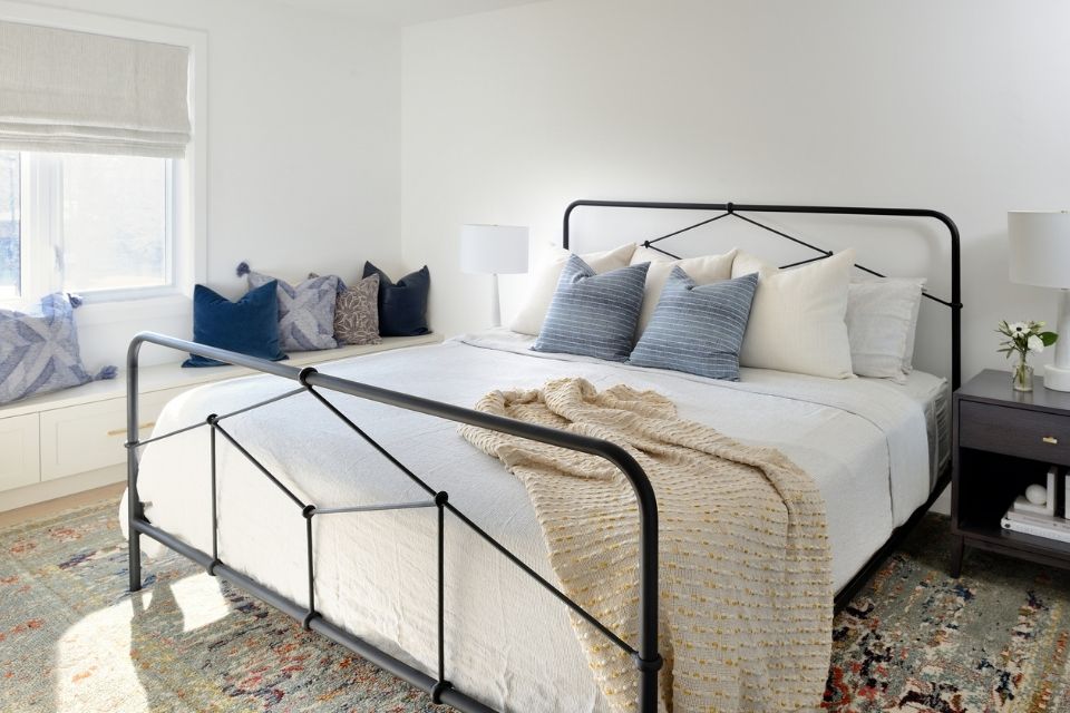
We are now going to head upstairs to the principal bedroom. This space also had a massive transformation. We took out a walk-in closet to create more space for a larger principal en suite.
We decided to add built-ins across the whole wall to provide even more functional space for closet storage. For continuity, we wanted to incorporate the same cabinetry color in these spaces too. Some fun knurled hardware was sourced to give this wall the visual pop it needed. We then dropped the cabinetry down into a bench to continue the storage. This spot is perfect for those extra shoes, purses, and bags—you know, the essentials.
Let’s head over to the en suite master bath; this light and airy bathroom is the perfect spot to get ready in the morning or wind down from a long day. Large-scale picket tiles were sourced to add a touch of texture and pattern while still keeping everything neutral. This amazing custom vanity provides the ample storage that we are all dying for. Could you imagine spending your mornings in here?
Creating a neutral space doesn’t mean it has to lack personality. Adding the elements that we walked you through here, like pattern, texture, and natural details like wood, linen, and stone, will create a harmonious-feeling space while staying timeless, versatile, and neutral.
We hope you all take away a little bit of inspiration from the magic that this project has to offer. Now get out there, be confident, and do your thing to create a space that is original, beautiful, and perfect for you!
Read more design advice from top expert interior designers on our blog and don't forget to check out our fall issue of Beautiful Design Made Simple!
Design by: MICHELLE BERWICK | Photography by: LARRY ARNAL