Modern Meets Boho A Dining Room Transformation
Jul 10, 2019 | Carpet One Floor & Home
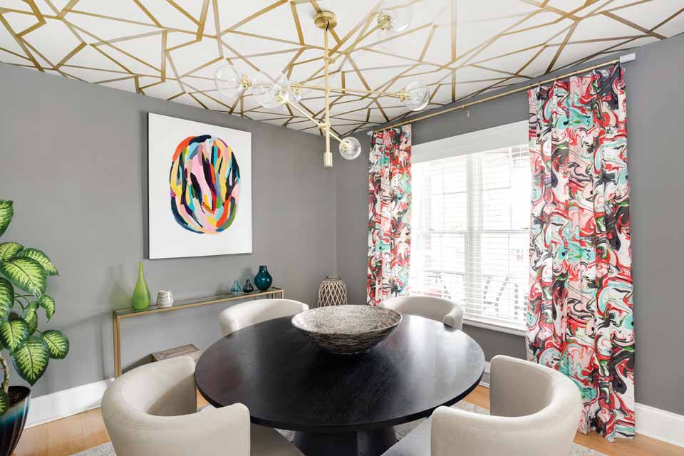
Interior designer Wendy Fennell was hired by a recently married couple to breathe new life into their stale, dated dining room in Charlotte, North Carolina’s up-and-coming Villa Heights neighborhood. The hip couple—who love to travel, cook, and entertain—had been resorting to eating meals in their living space to avoid their dining room, which was filled with a mishmash of oversized furniture from their single days. The new space needed to reflect their personalities, but it also needed to be functional and artsy with a modern and bohemian vibe, a place where they could enjoy their meals but also entertain their friends in cool digs. Wendy delivered just that and now walks us through the transformation, providing all the must-have design details in an exclusive Q&A with Beautiful Design Made Simple.

What was the goal for the dining space?
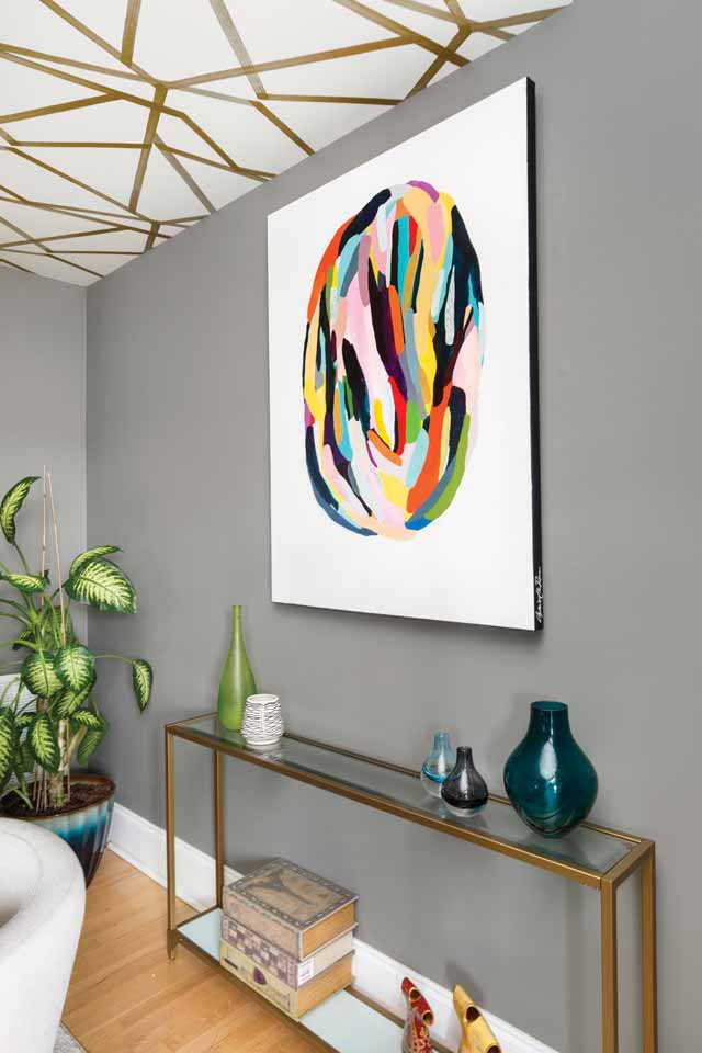
The space was small and supertight at 12 x 10 feet, and the table they had before was too large for the space. We went with a 52-inch round table, which fit perfectly with plenty of room for the chairs to be moved out from under the table. Round tables create a better flow and ease in which to move around. Every item we brought into their space had to also serve double duty; for example, the console also needed to work as a bar or serving buffet.
Was there a particular element that acted as the inspiration for the space’s overall design?
The piece of art on the design board really set the tone and inspiration for the dining space. The art is by Angie the Rose, whom I found on Instagram! She is a North Carolina artist, and I always try to use local and regional art as much as I can in my projects. These clients are well traveled and also really fun and adventurous, so I felt the piece of art matched their personalities to a T! And, as I walked around their home, I saw so many cool items from their travels.
The ceiling is so striking! And we adore how the chandelier melds perfectly into the gold, geometric detail. Can you speak to the selection process for these two elements?
My clients, being a bit bohemian with a modern edge, really like all the on-trend gold accents in lighting. While I was walking through their home, I was struck by all the items they had collected from their travels, so I knew the wallpaper and the light would highlight their owned items. I wanted the dining space to blend seamlessly into their home. She wanted a modern chandelier, one that would be fun, look cool from the living area, and provide enough light. The wallpaper is a pattern from Harlequin/Style (SUMI) Library, a UK company that I’ve used many times. The geometric lines in the pattern of this paper add just the right amount of drama and draw the eye up. Also, by using wallpaper on the ceiling, we only needed two rolls, so it was economical but still gave us the wow factor we wanted!
Round dining tables are becoming more and more popular. What makes this style work in this particular space, and what considerations should a person take into account before purchasing a round dining table for their home?
I adore round dining tables because they make for a more intimate dining experience. They are also a great option for smaller spaces because they don’t take up as much room as rectangular sizes.

Let’s talk color. Is there a trick to creating a vibrant yet cohesive color story?
I usually keep the wall color neutral and stick with about six to eight Benjamin Moore colors. In this case, the drapery fabric was very swirly and artsy (Kate Spade), so we kept the walls neutral to draw your eyes up to the fun, papered ceiling.
How did the flooring play into the design?
The house had the original hardwood floors, so we just covered them with a silvery-gray, neutral rug to ground the dining room table.
What advice would you give to someone who is drawn to bolder designs but is intimidated by the process of piecing the elements together?
I always recommend easing into bolder designs by adding pops of color with funky pillows or art or covering one wall with vibrant and fun wallpaper.
When designing a dining space in particular, what is one piece of advice that you can offer a homeowner?
Buy the best furniture you can afford, and invest in multiuse pieces, such as a console, which can be moved later to another room and used as a media center.
What do you love most about this space? And what do your clients love most?
I love how the overall design turned out. It’s fun and colorful but also very functional and sophisticated, just like my clients!
Wendy Fennell is the owner of Bohemian Bungalow Design, a residential design studio known for creating inspired and eclectic spaces through color, patterns, and texture. With a keen eye for layering in new furnishings along with vintage and owned items, Wendy creates beautifully curated and collected spaces that are unique to each client. @BohemianBungalowDesign