Personalized Traditional Living
Jan 27, 2020 | Carpet One Floor & Home

The challenge for this traditional-style family room was to lure this working couple back into their underutilized family room. Their children were now grown with families of their own. They wanted a space that reflected this next phase in their lives.
Over the years, the living room had become a catch-all for second-hand finds and hand-me-downs from close relatives. As you enter the home, the living room is located directly to your left, while the dining room is on your right. Visually these spaces needed to be cohesive in style and color palette.
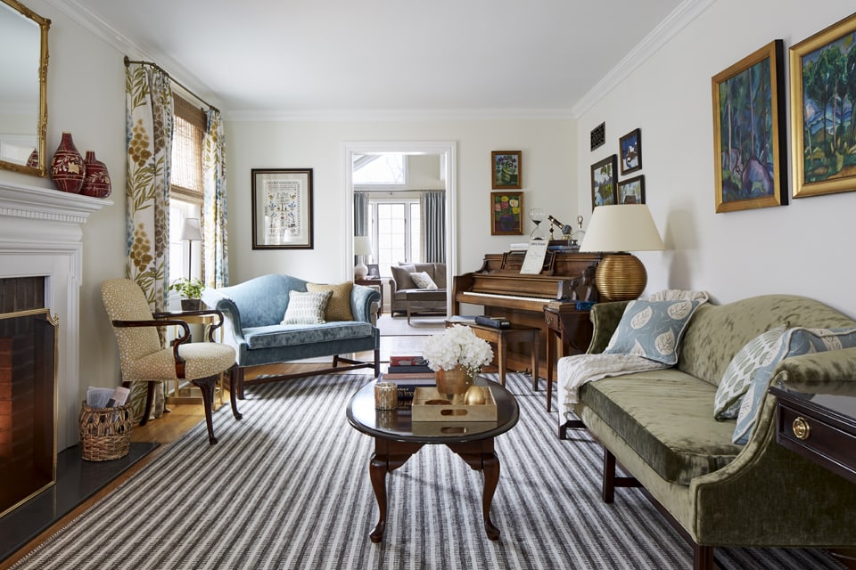
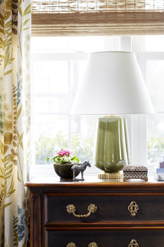
Since this space is long and somewhat narrow, we created several conversation areas. The center of the room allows for the larger sofa to be placed opposite the fireplace while the loveseat is angled next to the piano, one that belonged to the owner as a child. The owner’s chest of drawers, located at the front of the room, provides the perfect introduction to the space as we arranged a vignette of a lamp and personal possessions.
This particular client shared our design philosophy: if you study a room long enough it should start to tell a story. At the start of our design process, we always ask ourselves “how will this design best tell our client’s story?” Then we listen to our clients as they describe their vision for the space and how they intend to use it—how they need it to function for them. With this information, we then study the remaining spaces in the home, so as not to repeat the function or design of the other rooms.

Our main objective was to transform this living room into an uplifting, personal area of reflection while showcasing the creativity of the clients’ family and honoring the past. Our clients wanted to use their existing furniture as they were well made, heirloom pieces. The pieces were in mint condition making them the perfect candidates for reupholstery.
We began this project by converting the wood-burning fireplace to gas. Ease of use was important in making this space a destination to curl up with a book. The owners chose not to add a TV above the mantle or anywhere in this room for that matter. The mantle is original to the house and was in perfect condition so a new coat of paint was all that was needed, along with cleaning the brick surround. A new stone hearth replaced the dated polished slate.

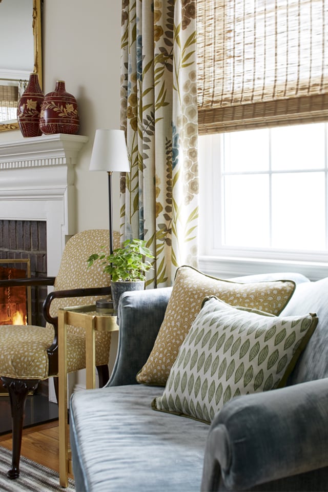
We replaced the crumbling plaster walls that dated back to the 1950s. Four-and-a-half-inch crown moldings were applied while the higher and wider base and door moldings add character to the space. The walls were originally painted a pale peach color that held such a high saturation value that it ate up all the light in the space; that color was replaced with a neutral ivory hue. This became the backdrop for what would be layered with pattern and color. As the home is north-facing, in order to maximize sunlight, we treated the windows with vintage-feel, botanical fabric panels in hues of blue, green, and mustard. Natural woven shades add texture; we chose them to allow sunlight to filter into the space yet provide much-needed privacy.
Our color story continues with the existing sofa and loveseat. We reupholstered each piece in a soft, tactile fabric with saturated, vibrant blue and green hues. We recovered a beloved Lawson-style armchair with a graphic hand-blocked print. It was important to add fabrics to this space that were handcrafted; both designer and client value the workmanship involved in such fabrics. The pillows dotted about the space continue the theme of nature, and their hues complement the botanical pattern of the window treatments.

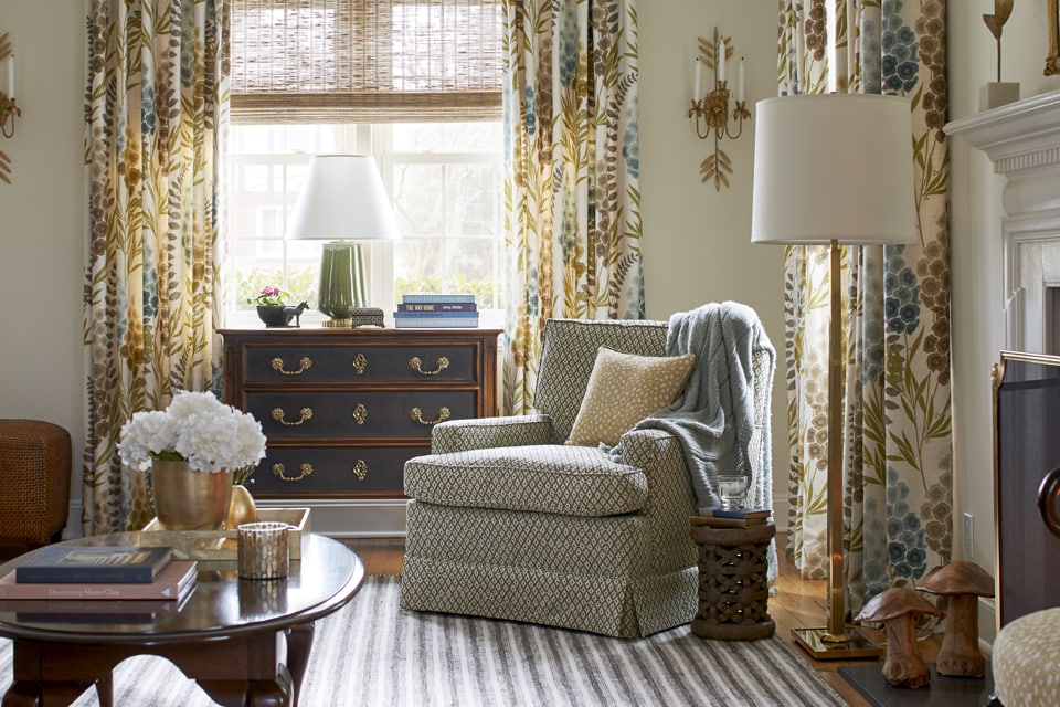
A gilded mirror was installed over the mantle is a nod to the traditional roots of this 1900s saltbox colonial. The horizontal-striped brown and cream custom wool rug was strategically laid to accentuate the length of this space. Two braided woven leather ottomans balance the client’s existing heirloom chest. They are light enough that they easily provide additional seating in a pinch. The story in this space continues with the artwork. Each piece of artwork holds a heartfelt meaning for this client. We reframed the sampler embroidered by our client when she was sixteen years old. The artist behind the paintings is the husband’s recently-deceased mother. Each painting tells the story of her struggle with Alzheimer’s. The process of narrowing down each piece (there were about fifty to choose from) began with a conversation about how her style changed as her disease progressed; we arranged the photos based on her descriptions.
The accessories in this room incorporate the owner’s love of all things vintage and hand-crafted. The one-of-a-kind Bamileke wooden stool found at auction becomes a resting place where the owners can place a drink. As a finishing touch, the hand-carved mushrooms by the fireplace emphasize the artistry of handmade items.
Fiori Interior Design Terri Fiori is the principal designer of Fiori Interior Design (FID), a full-service boutique interior design firm in Wyckoff, NJ that creates beautiful wellness environments. Their mission is to transform their clients’ homes into uplifting places—where everyone, regardless of their age—functions at their highest level. As a Certified Aging in Place Specialist (CAPS), Terri and the FID team love designing for multigenerational households and empty nesters.@TerriFiori