Urban to Suburban Designer QA
Jul 13, 2021 | Carpet One Floor & Home
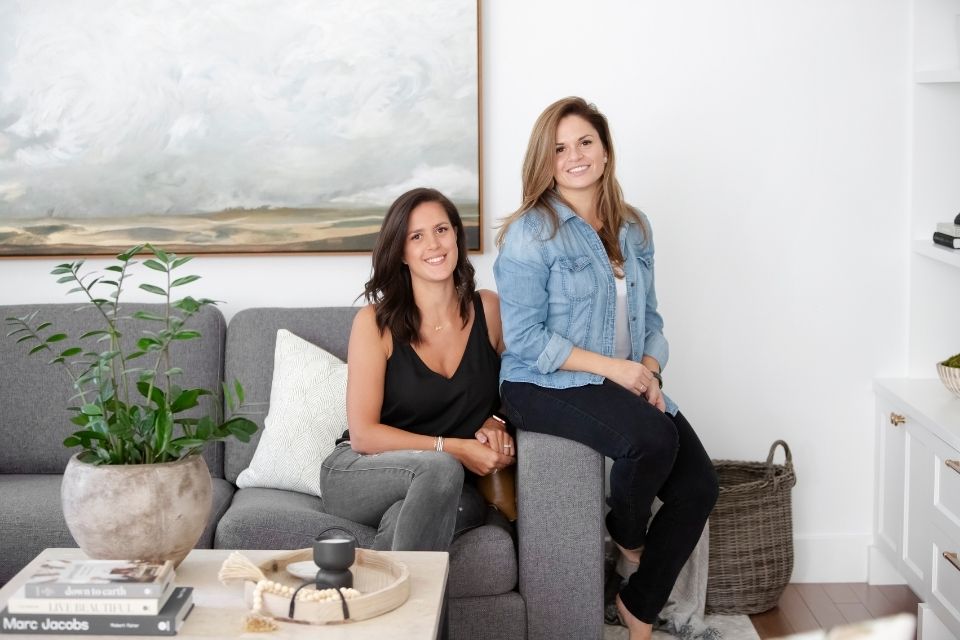
Korina Khamis and Eugenia Triandos are giving us the inside scoop and answering all of our questions about this beautiful, modern home full of stunning surprises around every corner.
Tell us about this home.
Our Urban to Suburban project was a new build home that we designed from the preliminary layout right down to the accessories. We worked with these clients on their last home located in the middle of Montreal, so when they decided to build a new home in the suburbs, they consulted with us before even confirming the lot.
What were the needs of your client?
Our clients wanted to build their dream home that checked all their boxes for both their current and future needs ahead. Our mandate was to create a home that flowed well with ample space for entertaining that maximized the natural light within their home. The property is in the suburb of Lorraine, located just thirty minutes from Montreal, surrounded by a lush forest with plenty of wildlife and it was very important to our clients to us to incorporate nature into the design and not obstruct any exterior views.
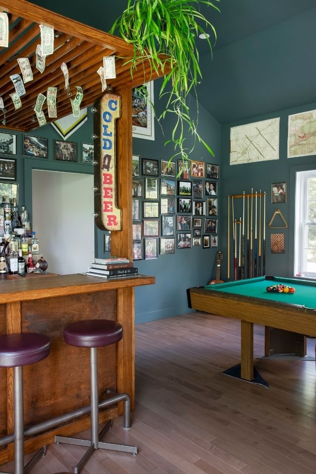
The homeowners also had an unconventional request of creating a secret man cave. The entrance is through the pantry and no one would know about it unless it is pointed out.
How do you approach a whole home renovation differently than when designing a select few spaces?
When designing the home from scratch we want to first make a list of the rooms we need to have included based on how the homeowners lived as a family. We then consider how those rooms relate to each other and that typically determines the layout and placement of the rooms. Natural light was a big component of this design, so window direction and placement were also a big factor in the final footprint. We focused to create a cohesive flow throughout the home in terms of aesthetic which is why we incorporated beautiful architectural details throughout like wall trim, coffered ceilings, and captivating archways.
We cannot get enough of the understated elegance of the foyer. What were the goals of this space?
We are all about first impressions, so the entranceway was very important to our team. The high ceilings, staircase, wall trim and arches all add to the initial impression as you walk in. It really sets the tone for the home. When dealing with a new build property it is important to consider architectural elements that are cohesive and respect a specific style. In this case the Georgian architectural influenced our interior selections and given the rural location we incorporated a lot of Craftsman style elements.
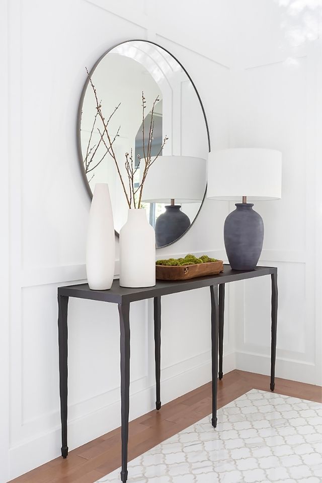
Speaking of the foyer, the expansive tile inlay is simply breathtaking. How does flooring play into the overall design of this home?
Because of the property restraints, a closed vestibule was not possible. We wanted to bring in warmth of the wood flooring to be carried throughout the open areas but we also needed the functionality of a tiled floor, so we designed a mosaic tile insert as you walk in that really added to the overall aesthetic of the entryway.
Let’s talk kitchens! What are your top five must-haves when it comes to kitchen design? Form or function.
When designing any kitchen, we start with the function first. We want to first create a work triangle between the fridge, range, and sink, with lots of counter space in between. One request from our clients was a giant island with nothing on it. We normally like to have a sink in the island, but in this case, we left it bare, which makes it the perfect gathering surface when entertaining. The full-length windows and patio doors were strategically placed to maximize the natural light, which also affected the overall kitchen design.
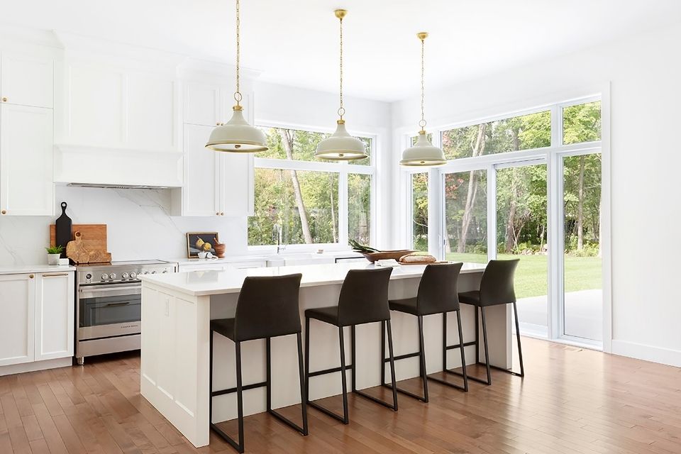
With a primarily white backdrop, how did you ensure that each room felt warm and inviting?
We love designing with white! We often design with lots of white so we have become pros at understanding how to infuse warmth into what can sometimes otherwise feel like a very sterile space. It is all about bringing in variety of warm elements like wood flooring, aged antique accents, hardware, lighting and textural wall coverings or wall trim and creating contrast through these accents.
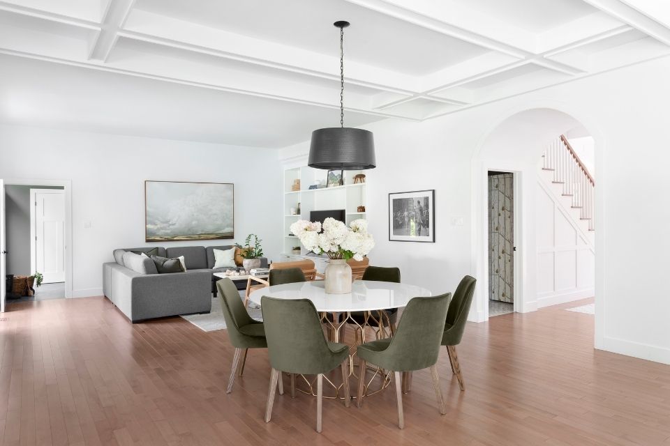
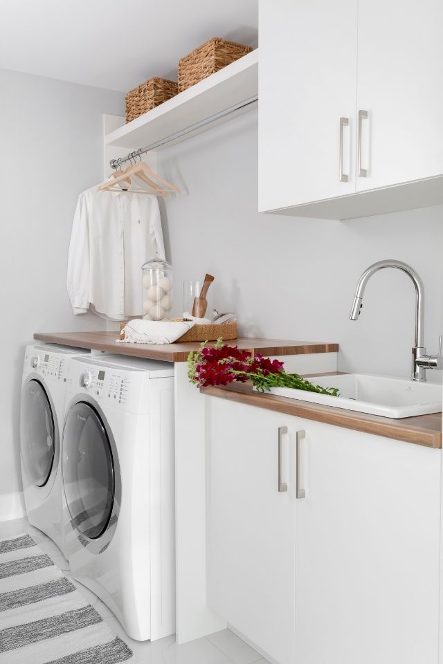
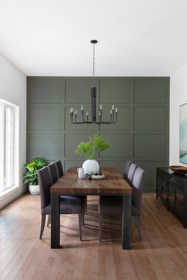
A gorgeous, earthy shade of green makes an appearance in more than one space in the home. Tell us about this color and the thought process behind how and where to use it.
You may notice that we brought in green accents throughout the main floor area, the accent wall in the dining room, the dinette chairs, the wall color in the mudroom. The goal was to bring a part of the outdoors in since the home was surrounded by trees and natural greenery. It was also the inspiration for bringing in the woodsy themed wallcoverings into the powder room.
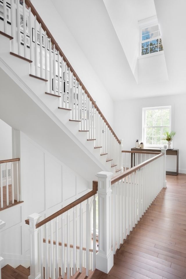
The multi-level staircase is such a treat! Tell us a little about it.
The staircase is really a main focal point of the home. It is bright because of the skylight that is above it as well as the windows on each landing area. The risers and spindles are painted white, and the treads were stained to match the flooring throughout.
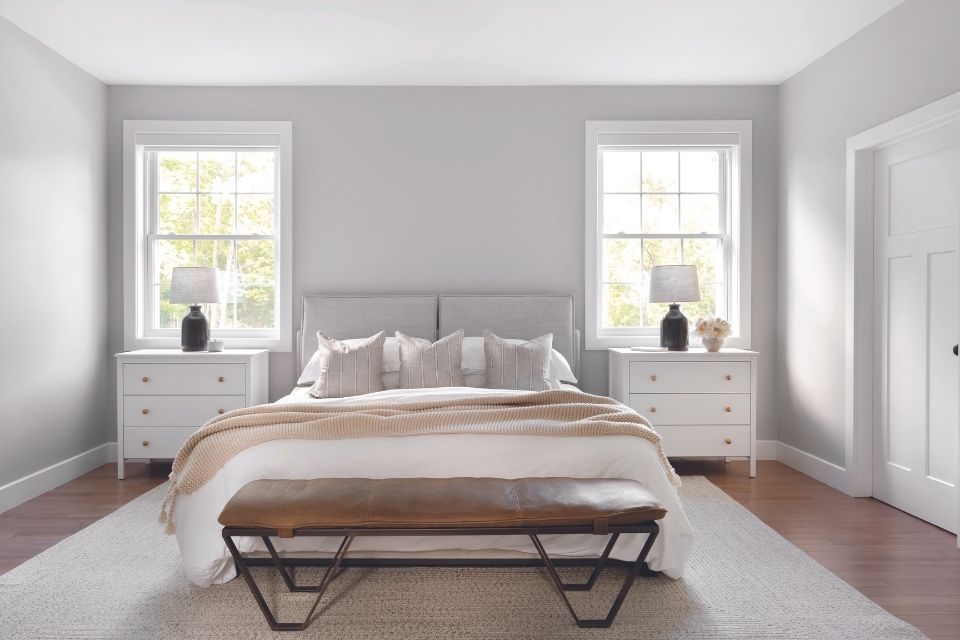
We were not expecting gray in the upstairs bedroom, but it could not be more perfect! As such an intimate space within the home, what special considerations do you make when it comes to design selections?
The vibe in the master bedroom is an extension of the main floor. Bright, cozy, with a lot of layered textural elements. The leather bench at the end of the bed adds warmth and texture. It feels a bit of a nod to cottage but still put together as this is their primary home. With double doors leading onto the bedroom, symmetry was important, the windows flank the bed and sit over the nightstands.
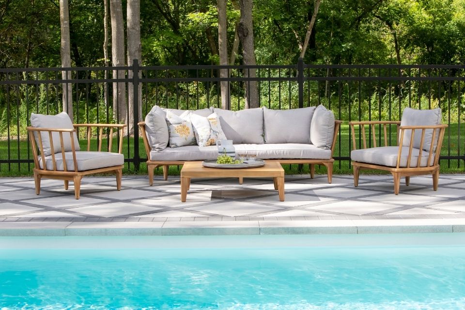
How do this home’s exterior design and outdoor spaces play into its interior?
The exterior landscaping and pool are visible from the family room, kitchen, and veranda so the clients wanted it to feel polished and put together. The shed just off the pool is a mini copy of the house with the same materials and color palette. The rectangular pool is large, symmetrical and surround by what seems like and endless forest. It is common to see deer, wild turkeys, bunnies, and other wildlife trotting across the property which completely adds to the warmth and charm.
Name one unique element in this home that sets it apart from the rest.
The man cave located off the pantry is a unique element of the design. Our client quirky personality is deeply reflected in the raw wood bar, original barber chair and memorabilia displayed throughout this room.
Home design by HIBOU DESIGN + CO.
Korina Khamis and Eugenia Triandos are the co-owners of Hibou Design + Co, based out of Montreal. Together, they are known for creating warm, charming interiors and bringing fresh design ideas while incorporating every client's individuality in the design.